Borders and Shadows in WordPress Gutenberg Blocks
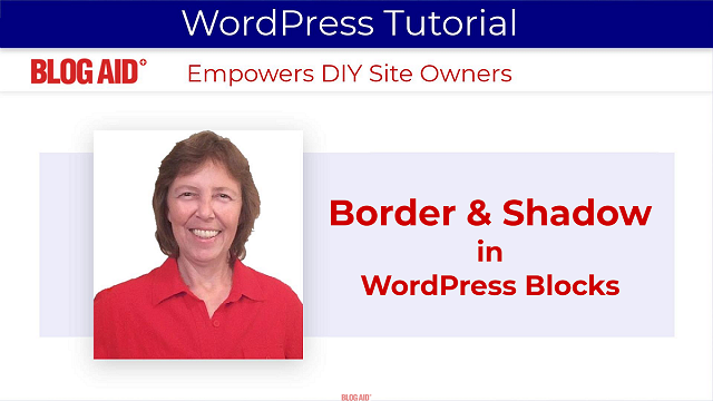
See how to add borders and drop shadows to Blocks in WordPress.
Supported Blocks
These styling features were added as of WordPress 6.5 in March 2024.
This video shows the 3 blocks supported at that time.
Subscribe to the BlogAid Tips Tuesday weekly post and newsletter to stay current with WordPress changes, just like these.
Video
A written tutorial is also below the video.

Written Tutorial
Scan the info below for how to add Borders and Shadow.
Access the Styles Tab
The new Borders and Shadows setting can be found in the Block Styles tab.
Here’s how to access it.
Click on the block to highlight it.
In the Block sidebar, click the half moon – this is the Styles tab.
Scroll to the bottom and you’ll see the Border & Shadows settings.
Turn on Shadow
I don’t know why WP chose to only have the Border settings turned on by default.
To turn on the Shadow settings:
- Click the More ellipsis in the top right.
- And then check Shadow in the flyout.
Apply Border & Shadow
Now that we know how to access these styles, let’s apply them.
Button
Click the button block to highlight it.
The Button block has a wrapper.
And you want to be sure to apply this effect to the button itself, not its wrapper.
Let’s add a drop shadow.
Click the Styles tab.
Scroll to the bottom for the Border & Shadow section.
Then click on Drop Shadow.
A pop up will appear where you can select the type of drop shadow you want to add.
Now, how all of this appears and acts will depend on your theme styling and settings for buttons.
Column
Next, let’s add a border to a column.
Click on the column Block.
And it also has a wrapper, and this time, you do want to apply these style settings to the wrapper, not to the individual columns.
Click on the Styles tab.
Scroll to the bottom for the Border & Shadow section.
Now let’s choose a color for our border.
The colors you see will depend on your theme settings.
And let’s select the number of Pixels to make our border by moving this slider.
You can also type in the number.
You may need to adjust your inner padding to accommodate the border, if your theme supports that style option.
Image
Now let’s try an image.
Click on the image Block.
Click on the Styles tab.
Scroll to the bottom for the Border & Shadow section.
Let’s choose a color for our border.
And let’s choose a size – lets make it big.
Now let’s round the corners of that border by changing the radius.
And if you make this big enough, it will make it look as if the corners of the image are rounded too.
Keep in mind that this is different from the Styles Rounded setting, which would round the corners of the image itself. But if your border is already providing that look, you won’t see much difference by clicking Rounded on the image.
And you can add a drop shadow as well.
It’s fun to play with all of these settings to get a lot of different looks.
That’s It
I hope you’ve enjoyed this quick tutorial on the Border and Shadow styling in WordPress.
Be sure to subscribe to Tips Tuesday to get your weekly dose of site success tips.